
Building an image gallery or gallery of any type is something almost every app needs. But of course you want to design something responsive so your app looks good on all devices, right?
In this Quick Win we will build a responsive image gallery for a standard image gallery and also with a more Pinterest like UI! In the image below you can see the responsive design for the normal gallery.
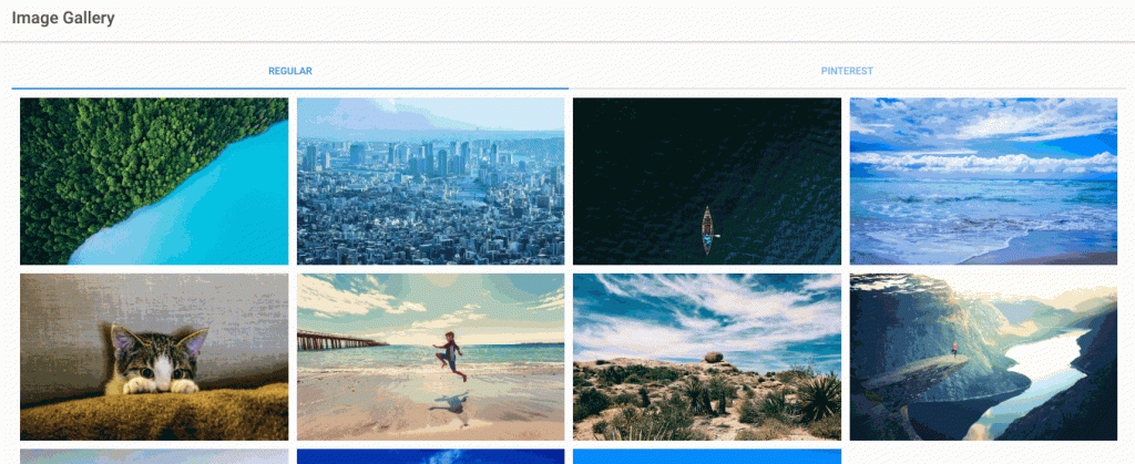
Building a Responsive Grid Gallery
First of all go ahead and create a blank new Ionic app like this:
|
1 |
ionic start ionicGallery blank |
Then make sure you have some images, I picked a few from Unsplash which offers awesome quality! Put all your images into the assets/img folder (create the img folder if it’s not yet there).
For the first responsive gallery we just use the Ionic Grid system which allows us to specify rows and columns.
In our case we only have one row and the columns will sort under each other if there is not enough space for each other. Remember that a row has space for 12 units.
To make our grid responsive we add some specific behaviour for breakpoints which means:
- col-6: On smallest devices a column takes 6 units, so we only have 2 columns
- col-md-4: After 720px size a column takes 4 units, so we have 3 columns
- col-xl-3: After 1140px size a column takes 3 units, so we have 4 columns
Of course you could change those values to create your unique responsive design here!
Inside the columns we actually set the image to the background-image attribute of a div so we can scale it to fill the whole column more easily!
My images are named 1 to 11.jpg that’s why I added a simply iteration right inside the code. Now go ahead and change your src/home/home.html to:
|
1 2 3 4 5 6 7 8 9 10 11 12 13 14 15 16 17 18 19 20 21 22 23 24 25 26 27 28 29 30 31 32 33 |
<ion-header> <ion-navbar> <ion-title> Image Gallery </ion-title> </ion-navbar> </ion-header> <ion-content padding> <ion-segment [(ngModel)]="galleryType" color="primary"> <ion-segment-button value="regular"> Regular </ion-segment-button> <ion-segment-button value="pinterest"> Pinterest </ion-segment-button> </ion-segment> <div [ngSwitch]="galleryType"> <!-- Responsive Layout with Ion Grid--> <ion-grid *ngSwitchCase="'regular'"> <ion-row> <ion-col col-6 col-md-4 col-xl-3 *ngFor="let image of [1,2,3,4,5,6,7,8,9,10,11]"> <div class="image-container" [style.background-image]="'url(assets/img/' + image + '.jpg)'"></div> </ion-col> </ion-row> </ion-grid> <!-- More Pinterest floating gallery style --> </div> </ion-content> |
To the example I also added a Segment Button to change between our 2 styling approaches. It’s nothing special related to this design, it simply wraps the both blocks and we can toggle either of them.
If you don’t want it, simply remove the button and the ngSwitchCase stuff.
Currently your app will not really look like a stylish gallery, that’s because we still need to style the div inside our column. As we have set the image to the background, the content will be way to small.
Therefore add a reasonable min-height to your styling so your gallery looks more polished. Also, we need to set the background-size to cover so our image fills the whole column and is not scaled to wrong dimensions. Open your src/pages/home/home.scss and insert:
|
1 2 3 4 5 6 |
page-home { .image-container { min-height: 200px; background-size: cover; } } |
Now finally we need a variable inside the src/pages/home/home.ts just for our segment control so we can always start on the first design:
|
1 2 3 4 5 6 7 8 9 10 11 |
import { Component } from '@angular/core'; import { NavController } from 'ionic-angular'; @Component({ selector: 'page-home', templateUrl: 'home.html' }) export class HomePage { galleryType = 'regular'; constructor(public navCtrl: NavController) { } } |
So now we got a flexible image gallery that will look good across different screen sizes just like you saw in the initial animation in this post.
Building a Pinterest Layout
For Pinterest, the images are not aligned that strictly and just take the space that’s available. I was unable to reproduce this behaviour with the Ionic Grid, so I had to find a different solution which would still be responsive.
First of all we have a design made up of a div as container of the images and then divs which contain one single image. Both of these div elements will get specific styling, for now you can add the code below to your src/pages/home/home.html:
|
1 2 3 4 5 6 |
<!-- More Pinterest floating gallery style --> <div class="images" *ngSwitchCase="'pinterest'"> <div class="one-image" *ngFor="let image of [1,2,3,4,5,6,7,8,9,10,11]"> <img src="assets/img/{{image}}.jpg"> </div> </div> |
Put it where we previously had the comment, then everything should be fine with the switch. Now we need a design for this approach, and we use media queries here to set the number of columns for different device sizes.
It’s more or less the same what we did in the first part with the column size and rows, but in this case there is not other special Ionic Grid stuff going on in the background so our rows will magically use all the available space!
Go ahead and change your src/pages/home/home.scss to:
|
1 2 3 4 5 6 7 8 9 10 11 12 13 14 15 16 17 18 19 20 21 22 23 24 25 26 27 28 29 |
page-home { .image-container { min-height: 200px; background-size: cover; } @media (min-width: 0px) { .images { column-count: 2; } } @media (min-width: 420px) { .images { column-count: 3; } } @media (min-width: 720px) { .images { column-count: 4; } } .one-image { margin: 2px; } } |
Now you got 2 different design, both are responsive image galleries!
Which design is your favorite?
I somehow like the clean first approach using the Ionic components and the clean image gallery 🙂
You can also find a video version of this Quick Win below!
Thank you work for me
muchas gracias, funcionan como lo queria <3
Thanks, it’s working great… But the problem is in my case, I have added infinity scrolling and after it scrolls down the images from right column comes to the left and then it fills the right column with new images every time when I am pushing images to the array… Sample Diagram: https://uploads.disquscdn.com/images/4d4500ff4c828e28c1afa0edc2ebc46be30acac6b19ea4619de994fad200575f.jpg
Hello sir, just like this if i have a more then 100 images in folder at that time how can i display all image in grid view like above you explained without their file name like 1.jpg,2.jpg, 3.jpg…etc, if i try like this is too long so sir is there any way to get all image in app?