Ionic is awesome for building cross-platform apps as you know, but actually it’s also super easy to build for different device sizes, which makes it even more versatile!
In this Quick Win we will build a user interface with Ionic that works on different device sizes ranging from mobile phone size to iPad and even desktop browser. Our UI will adapt to the available space and make the best out of the given space!
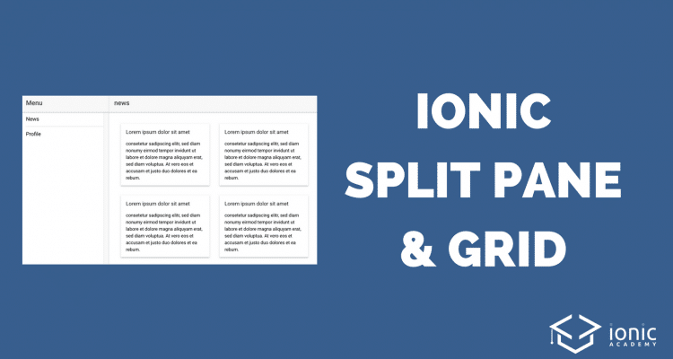
The result will look like in the image below.
Starting our App
We start with a blank app and add two more pages which we can display in a menu later. Simply go ahead and run:
|
1 2 3 4 |
ionic start flexibleSize blank cd flexibleSize ionic g page news ionic g page profile |
There are no providers or other packages we have to add, so we are now fine to add our responsive UI. Also, I recommend not using the Ionic lab command in this example as this only gives you a phone size preview. So run ionic serve and resize your browser window to your needs!
The Split Pane
The first component we need in this quick win is the special Ionic Split Pane.
The specialty of the split pane is that we can have a side menu on bigger devices, and define when this side menu should be hide behind a button on smaller devices!
When we define a split pane the markup looks almost like that of a side menu (and basically it is a side menu). So we need an area of the menu, and a ion-nav element where the main content will be rendered.
Therefore go ahead and change your src/pages/home/home.html to:
|
1 2 3 4 5 6 7 8 9 10 11 12 13 14 15 16 17 18 19 |
<ion-split-pane> <!-- side menu --> <ion-menu [content]="content"> <ion-header> <ion-toolbar> <ion-title>Menu</ion-title> </ion-toolbar> </ion-header> <ion-content> <ion-list> <button ion-item (click)="open('NewsPage')" menuClose>News</button> <button ion-item (click)="open('ProfilePage')" menuClose>Profile</button> </ion-list> </ion-content> </ion-menu> <!-- content --> <ion-nav [root]="root" main #content></ion-nav> </ion-split-pane> |
We have a side menu with two items (which will open our previously generated pages) and the main content defined which will use the root variable of our class.
Now we need to implement the function for our menu, which will always set our root page to the selected page. Go ahead and change your src/pages/home/home.ts to:
|
1 2 3 4 5 6 7 8 9 10 11 12 13 14 15 16 17 |
import { Component } from '@angular/core'; import { NavController } from 'ionic-angular'; @Component({ selector: 'page-home', templateUrl: 'home.html' }) export class HomePage { root = 'NewsPage'; constructor(public navCtrl: NavController) { } open(pageName) { this.root = pageName; } } |
Now we already got our responsive app!
Try to make your browser as big as possible and then resize it to a small device. You will notice that the menu will be open by default once you reach a certain stage (by default if the size is larger than 768px) and it will disappear below that size.
This now allows you to build a cool UI for your phone users will offering a more useful appearance on bigger devices where we have enough space for a side menu to be permanently visible.
Of course you can change the breakpoint of your menu size or make it even dependent on a function, just check out the docs for more info.
Responsive Grid Items
Our overall architecture is now responsive, but the actual content of the screen is not super responsive by default.
Ok in our case we don’t have any content yet, but trust me that everything you see on a small device will most of the time try to stretch and fill the bigger device sizes which looks kinda ugly most of the time.
Therefore, we can make use of the Ionic Grid system and breakpoints for different screen sizes.
In this example we will add Ionic cards and make the grid system use different column sizes at different stages.
First, we add some items which we can than use inside the view. Open your src/pages/news/news.ts and insert:
|
1 2 3 4 5 6 7 8 9 10 11 12 13 14 15 16 17 18 19 |
import { Component } from '@angular/core'; import { IonicPage, NavController, NavParams } from 'ionic-angular'; @IonicPage() @Component({ selector: 'page-news', templateUrl: 'news.html', }) export class NewsPage { newsItems = [ {title: 'Lorem ipsum dolor sit amet', text: 'consetetur sadipscing elitr, sed diam nonumy eirmod tempor invidunt ut labore et dolore magna aliquyam erat, sed diam voluptua. At vero eos et accusam et justo duo dolores et ea rebum.'}, {title: 'Lorem ipsum dolor sit amet', text: 'consetetur sadipscing elitr, sed diam nonumy eirmod tempor invidunt ut labore et dolore magna aliquyam erat, sed diam voluptua. At vero eos et accusam et justo duo dolores et ea rebum.'}, {title: 'Lorem ipsum dolor sit amet', text: 'consetetur sadipscing elitr, sed diam nonumy eirmod tempor invidunt ut labore et dolore magna aliquyam erat, sed diam voluptua. At vero eos et accusam et justo duo dolores et ea rebum.'}, {title: 'Lorem ipsum dolor sit amet', text: 'consetetur sadipscing elitr, sed diam nonumy eirmod tempor invidunt ut labore et dolore magna aliquyam erat, sed diam voluptua. At vero eos et accusam et justo duo dolores et ea rebum.'} ]; constructor(public navCtrl: NavController, public navParams: NavParams) { } } |
Now we got an array to create cards from. We use the Ionic grid and inside one row craft the number of Ionic cards based on our array, each as one column.
Open your src/pages/news/news.html and insert:
|
1 2 3 4 5 6 7 8 9 10 11 12 13 14 15 16 17 18 19 20 21 |
<ion-header> <ion-navbar> <button ion-button menuToggle> <ion-icon name="menu"></ion-icon> </button> <ion-title>news</ion-title> </ion-navbar> </ion-header> <ion-content padding> <ion-grid> <ion-row> <ion-col col-12 col-md-6 col-lg-4 col-xl-3 *ngFor="let item of newsItems"> <ion-card> <ion-card-header>{{ item.title }}</ion-card-header> <ion-card-content>{{ item.text }}</ion-card-content> </ion-card> </ion-col> </ion-row> </ion-grid> </ion-content> |
You can see that we also added a somehow cryptical expression to our grid column, right?
So let’s take a closer look what this means:
- col-12: By default, one column takes all the space
- col-md-6: When the screens min width is 768px, one column takes the space of 6
- col-lg-4: When the screens min width is 992px, one column takes the space of 4
- col-xl-3: When the screens min width is 1200px, one column takes the space of 3
This means, on all devices smaller than 768px we will only have one column per row. If the size gets bigger, we have 2, 3 or 4 columns per row! Remember, the general grid has 12 units available, so we split these 12 units accordingly.
Also note that we added a button here with the menuToggle directive. This button will only appear once our menu is hidden (on smaller devices) and open up the menu on click!
If you now run your app inside the browser and resize the view, you will notice how the split pane changes the architecture and also how the grid and columns change inside the news screen.
You can watch a video version of this Quick Win below.
Thanks for such a nice post.