Welcome to the 6. lesson of the Ionic Crash Course!
Today we will make our app look more like an actual Star Wars app. Although the out of the box styling of Ionic is great and really helps to get started faster, we want of course our own touch of colors!
Therefore we take a look at 2 different parts of the styling: Applying some general styling though SASS and a more granular styling with CSS variables used in Ionic.
1. Places to change the UI
First of all, in general we can style our app through all kinds of CSS and also SASS.
You might have noticed that each new generated page comes with its own SASS file, so those files are used to directly style one specific page.
Additional we got the theme folder right next to our app folder. This is a place to override Ionic variables(more on this in the next section) and to import e.g. custom fonts or more individual styling files.
Finally we also got another SASS file at app/global.scss where we can apply some global styling to our app.
These 3 are the areas where we can add styling, and of course we need to work with our HTML to apply CSS classes to different objects.
2. Overriding Ionic Variables
We have already used the Ionic styling at some points, you might have noticed expressions like this:
|
1 |
<ion-toolbar color="primary"> |
If you have asked yourself where that blue color came from, the answer to the question is the colors definition inside src/theme/variables.scss.
You can either change the values by hand, or what I would recommend, use the amazing color generator to create the whole file with new colors!
Ionic uses these CSS variables and a special colors map internally to allow faster styling directly on components! If you would use those variables throughout your application all the time, you could change the whole color scheme within minutes (or even seconds).
In our case, we can also make use of it as we have used the primary color a few times, so I’ve played around with the color generator and the result could be this:
|
1 2 3 4 5 6 7 8 9 10 11 12 13 14 15 16 17 18 19 20 21 22 23 24 25 26 27 28 29 30 31 32 33 34 35 36 37 38 39 40 41 42 43 44 45 46 47 48 49 50 51 52 53 54 55 56 57 58 59 60 61 62 63 64 65 66 67 68 69 70 71 72 73 74 75 76 |
/** Ionic CSS Variables **/ :root { /** primary **/ --ion-color-primary: #272b30; --ion-color-primary-rgb: 39,43,48; --ion-color-primary-contrast: #ffffff; --ion-color-primary-contrast-rgb: 255,255,255; --ion-color-primary-shade: #22262a; --ion-color-primary-tint: #3d4045; /** secondary **/ --ion-color-secondary: #FFE300; --ion-color-secondary-rgb: 255,227,0; --ion-color-secondary-contrast: #000000; --ion-color-secondary-contrast-rgb: 0,0,0; --ion-color-secondary-shade: #e0c800; --ion-color-secondary-tint: #ffe61a; /** tertiary **/ --ion-color-tertiary: #7044ff; --ion-color-tertiary-rgb: 112,68,255; --ion-color-tertiary-contrast: #ffffff; --ion-color-tertiary-contrast-rgb: 255,255,255; --ion-color-tertiary-shade: #633ce0; --ion-color-tertiary-tint: #7e57ff; /** success **/ --ion-color-success: #10dc60; --ion-color-success-rgb: 16,220,96; --ion-color-success-contrast: #ffffff; --ion-color-success-contrast-rgb: 255,255,255; --ion-color-success-shade: #0ec254; --ion-color-success-tint: #28e070; /** warning **/ --ion-color-warning: #FFE300; --ion-color-warning-rgb: 255,227,0; --ion-color-warning-contrast: #000000; --ion-color-warning-contrast-rgb: 0,0,0; --ion-color-warning-shade: #e0c800; --ion-color-warning-tint: #ffe61a; /** danger **/ --ion-color-danger: #f53d3d; --ion-color-danger-rgb: 245,61,61; --ion-color-danger-contrast: #ffffff; --ion-color-danger-contrast-rgb: 255,255,255; --ion-color-danger-shade: #d83636; --ion-color-danger-tint: #f65050; /** dark **/ --ion-color-dark: #1c1e22; --ion-color-dark-rgb: 28,30,34; --ion-color-dark-contrast: #ffffff; --ion-color-dark-contrast-rgb: 255,255,255; --ion-color-dark-shade: #191a1e; --ion-color-dark-tint: #333538; /** medium **/ --ion-color-medium: #989aa2; --ion-color-medium-rgb: 152,154,162; --ion-color-medium-contrast: #ffffff; --ion-color-medium-contrast-rgb: 255,255,255; --ion-color-medium-shade: #86888f; --ion-color-medium-tint: #a2a4ab; /** light **/ --ion-color-light: #f4f5f8; --ion-color-light-rgb: 244,244,244; --ion-color-light-contrast: #000000; --ion-color-light-contrast-rgb: 0,0,0; --ion-color-light-shade: #d7d8da; --ion-color-light-tint: #f5f6f9; } |
All these variables will be added to the root element of our app so all components get those values.
These colors can also be used in custom SCSS files for each page, but more on that later.
This change already changes a bit of the appearance, but we want more!
What we can do additional is to override more Ionic CSS Variables. There are a bunch of variables (in fact almost everything) that we can directly override to make our app look like we want it to.

Of course you can’t know the names of all these variables, but the documentation has a search bar so try to search for the element you want to change the style for and give it a try.
Caution: At the time of writing this the docs are not yet ready so you have to find out the names on your own, but we’ll also take a look at how to do this inside the last day of the course.
For now we add these override statements above the colors map from before (still inside :root):
|
1 2 3 4 5 6 7 8 9 10 11 12 13 14 15 16 17 |
--ion-background-color: var(--ion-color-dark); --ion-text-color: #fff; --ion-tab-bar-background: var(--ion-color-primary); ion-tab-button { --color-selected: var(--ion-color-secondary); } --ion-text-color-rgb: 255, 255, 255; ion-card { --color: #fff; } ion-item { --border-color: var(--ion-color-light); --detail-push-color: var(--ion-color-light); } |
Now we have set the values that Ionic internally uses to style the components to some other values, and we have used the CSS var() function to retrieve other values directly from the previously defined colors – something you can do from all your SASS files inside the project!
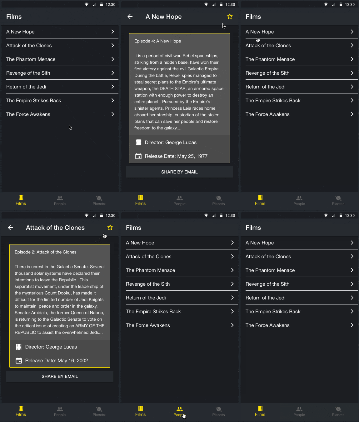
If you run your app now it looks already a lot more like a Star Wars app!
3. Custom CSS
While we have previously changed big parts of our app, we now want to only target a specific page. Of course you can’t make all the styling global, because at some point you will break your stuff and everything goes down.
In our case we build out our FilmDetailsPage a bit more to include a few more information and also use more of our better defined colors map. We can use the keywords from that map directly inside the HTML, and to all other items that need special treatment we assign their own CSS class.
Open your pages/film-details/film-details.page.html and change it to:
|
1 2 3 4 5 6 7 8 9 10 11 12 13 14 15 16 17 18 19 20 21 22 23 24 25 26 27 28 29 30 31 32 33 34 35 36 37 38 39 |
<ion-header> <ion-toolbar color="primary"> <ion-buttons slot="start" defaultHref="/tabs/(films:films)"> <ion-back-button></ion-back-button> </ion-buttons> <ion-title>{{ film?.title }}</ion-title> <ion-buttons slot="end"> <ion-button (click)="unfavoriteFilm()" *ngIf="isFavorite"> <ion-icon name="star" slot="icon-only" color="secondary"></ion-icon> </ion-button> <ion-button (click)="favoriteFilm()" *ngIf="!isFavorite"> <ion-icon name="star-outline" slot="icon-only" color="secondary"></ion-icon> </ion-button> </ion-buttons> </ion-toolbar> </ion-header> <ion-content padding> <ion-card *ngIf="film" class="movie-card"> <ion-card-header>Episode {{ film.episode_id }}: {{ film.title }}</ion-card-header> <ion-card-content> {{ film.opening_crawl }} </ion-card-content> <ion-item class="movie-info" lines="none"> <ion-icon name="film" slot="start"></ion-icon> Director: {{ film.director }} </ion-item> <ion-item class="movie-info" lines="none"> <ion-icon name="calendar" slot="start"></ion-icon> Release Date: {{ film.release_date | date }} </ion-item> </ion-card> <ion-button expand="full" (click)="shareFilm()">Share by Email</ion-button> </ion-content> |
Besides a few more classes and keyword nothing really fancy. Every web developer should feel right at home!
Of course we now need to define the classes, and this can be done in the according Sass file that was initially already created for us, so replace everything inside pages/film-details/film-details.page.scss with:
|
1 2 3 4 5 6 7 |
.movie-card { background: #545454; border: 1px solid var(--ion-color-secondary); } .movie-info { --background: #4a4a4a; } |
As you can see, we can make use of the colors map again.
If you want to keep your styling as flexible as possible, try to have your main colors inside that map and simply use the function to load them in the other pages styling files!
If you run your app now your result should look like below.

4. Next Steps
Congratulations on finishing the 6. lesson!
You are now almost an Ionic pro. Well..but you can build apps somehow! And that’s good news.
Styling your Ionic app really comes down to basic CSS skills. Of course there is less space and you shouldn’t work too much with absolute positions due to the different sizes of devices, but in general it’s CSS!
If you can make a web app look good, you can do the same with Ionic. If you’re coming from a native language, this might also be a bit more relaxing and easy than what you have known before.
Tomorrow we will take a final look at debugging because I don’t want to let you out in the wild without knowing about the appropriate tools to fix your bugs!
But of course you can always find help here as a member inside the Ionic Academy!
