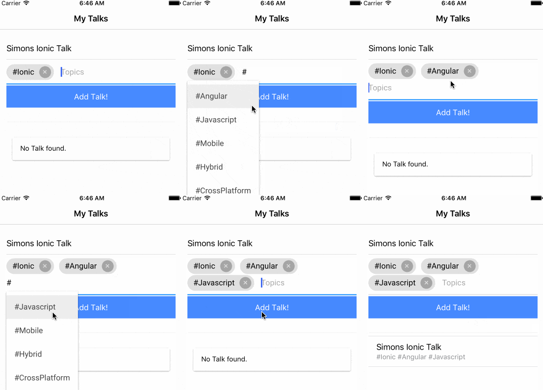
When you want to automatically transform your input values into small chunks or tokens just like the Facebook app, you will not get far with the standard inputs we have.
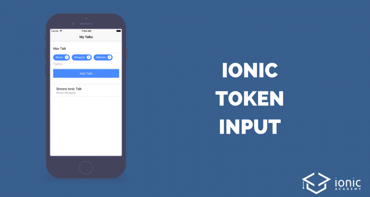
But lucky us there is an Angular package that will help us to tokenize our input field and split our values into nice visual blocks. In this quick win we will build our own app with tokeninput and change some of the styling and display the added results inside a list. Our final will look like below!

Setup our Tokeninput App
We start with a blank Ionic app and install the needed NPM package so go ahead and run:
|
1 2 3 |
ionic start tagInput blank cd tagInput npm install angular2-tag-input --save |
Now we need to make sure that we add it to our src/app/app.module.ts imports array, therefore change it to:
|
1 2 3 4 5 6 7 8 9 10 11 12 13 14 15 16 17 18 19 20 21 22 23 24 25 26 27 28 29 30 31 32 33 |
import { BrowserModule } from '@angular/platform-browser'; import { ErrorHandler, NgModule } from '@angular/core'; import { IonicApp, IonicErrorHandler, IonicModule } from 'ionic-angular'; import { SplashScreen } from '@ionic-native/splash-screen'; import { StatusBar } from '@ionic-native/status-bar'; import { MyApp } from './app.component'; import { HomePage } from '../pages/home/home'; import {RlTagInputModule} from 'angular2-tag-input'; @NgModule({ declarations: [ MyApp, HomePage ], imports: [ BrowserModule, IonicModule.forRoot(MyApp), RlTagInputModule ], bootstrap: [IonicApp], entryComponents: [ MyApp, HomePage ], providers: [ StatusBar, SplashScreen, {provide: ErrorHandler, useClass: IonicErrorHandler} ] }) export class AppModule {} |
We are ready to use the tokenize package now!
Implement the Tokenize Functions and View
There are 2 different ways to use our package: We can either specify an array for auto suggestions which users can pick from or we could just allow anything.
In our example we create an array of some hashtags where the user can select the appropriate ones for his talk (the talks idea came from a question inside the community of the Ionic Academy).
We also store the name of a talk and push the talk we create to an array once the user saves his input. Nothing really fancy here, so go ahead and change your src/pages/home/home.ts to:
|
1 2 3 4 5 6 7 8 9 10 11 12 13 14 15 16 17 18 19 20 21 22 23 24 25 26 27 |
import { Component } from '@angular/core'; import { NavController } from 'ionic-angular'; @Component({ selector: 'page-home', templateUrl: 'home.html' }) export class HomePage { topics = []; name: string; talks = []; preparedTags = [ '#Ionic', '#Angular', '#Javascript', '#Mobile', '#Hybrid', '#CrossPlatform' ] constructor(public navCtrl: NavController) {} addTalk() { this.talks.push({name: this.name, topics: this.topics}); } } |
If you don’t want the autocomplete you can leave that out of course.
Now the view is the actual interesting stuff here. We add a field for the talks name and also the rl-tag-input which is the element we can use because we install the tag input package!
There are quite a few options which we can specify on the element, you can check all of them here.
For now we use the following:
- ngModel: The object which holds the input in form of an array
- addOnBlur: Whether the item should be added once the field loses focus, not really helpful so false
- autocomplete: Activate to show a box with autocomplete options
- autocompleteItems: The array that will be looked up for the autocomplete function
- placeholder: Well..the placeholder for the input field
Besides that we just craft a simple list below the fields to show our array of current added talks. The topics for a talk will be an array, so we use the join() function to craft a string where each token is separated by a space.
Now go to your src/pages/home/home.html and change it to:
|
1 2 3 4 5 6 7 8 9 10 11 12 13 14 15 16 17 18 19 20 21 22 23 24 25 26 27 28 29 30 31 32 33 34 35 36 |
<ion-header> <ion-navbar> <ion-title> My Talks </ion-title> </ion-navbar> </ion-header> <ion-content padding> <ion-item no-padding> <ion-input [(ngModel)]="name" placeholder="My Awesome Talk"></ion-input> </ion-item> <rl-tag-input [(ngModel)]="topics" [addOnBlur]="false" [autocomplete]="true" [autocompleteItems]="preparedTags" placeholder="Topics"> </rl-tag-input> <button ion-button full (click)="addTalk()">Add Talk!</button> <br><hr> <ion-list> <ion-item *ngFor="let talk of talks"> {{ talk.name }} <p> {{ talk.topics.join(' ') }} </p> </ion-item> </ion-list> <ion-card *ngIf="talks.length === 0"> <ion-card-content>No Talk found.</ion-card-content> </ion-card> </ion-content> |
This looks already pretty good now, but I found that some additional styling makes it look even more mobile as the general package is meant for Angular and web apps I guess.
The selectors are directly retrieved from inspecting the view elements, perhaps there’s also a better way of doing these things but for now this works, so open your src/pages/home/home.scss and insert:
|
1 2 3 4 5 6 7 8 9 10 11 12 13 14 15 |
page-home { [_nghost-c1] { background-color: color($colors, primary); border-radius: 40px; font-size: 14px; color: #fff; } [_nghost-c1] .ng2-tag-input-remove[_ngcontent-c1] { color: color($colors, primary); background: #fff; height: 20px; width: 20px; line-height: 20px; } } |
Now you got your own input field with tokenize function and also autocomplete, how cool is that?
If you find a better way of styling it definitely let me know, otherwise go ahead and add this function to your app because your users will love it!
You can find a video of this quick win below.
